Bode diagrams or Bode plots are an alternative method for displaying frequency responses graphically. Instead of plotting the phase and gain information on the same plot (as in the polar locus) the Bode plot uses two separate plots, one for the magnitude (or gain) and the other for the phase.
Polar loci are (for complex systems) hard to draw accurately without reasonable computations. Bode plots are often used instead since it is fairly easy to obtain accurate sketches. The plots are of:
- Gain (measured in )
- Phase, (usually in degrees), Plotted against frequency, , in usually in rad/s on a logarithmic scale.
Thus by using these conventions, in both the magnitude and phase plots we can break down the overall magnitude or phase into a sum of individual components. We therefore only need to consider the elementary diagrams for simple components which can then be combined for more complex systems.
Strategy:
Rewrite TF into Correct Form
We would like to rewrite this so the lowest order term in the numerator and denominator are both unity.
This is best done through examples:
i)
Lowest order here is 0, equal to 1
ii)
The lowest power in the numerator was 1, therefore we solved as such
iii)
 In this example the denominator was already factored.
In cases like this, each factored term needs to have unity as the lowest order power of s (zero in this case).
In this example the denominator was already factored.
In cases like this, each factored term needs to have unity as the lowest order power of s (zero in this case).
Separate the TF into parts
There are 7 types of parts
- A constant
- Poles at the origin
- Zeros at the origin
- Real Poles
- Real Zeros
- Complex conjugate poles
- Complex conjugate zeros
Look at ex i) : - Constant of 6 - Zero at Complex Conj Poles at roots of () It is better instead to look at our standard form , which means ,
ex ii):
Constant of 3
Zero at origin
,
ex iii):
Constant of 2
Zero at
Poles at
Draw the Bode diagram for each part.
| Term | Magnitude | Phase |
|---|---|---|
| Constant: K | ||
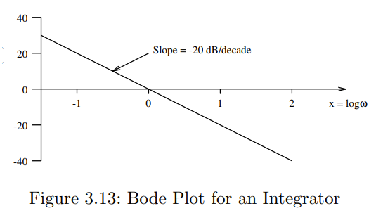
| Pole at Origin (Integrator) | -20 dB/decade passing through 0 dB at | |
| Zero at Origin (Differentiator) | +20 dB/decade passing through 0 dB at ω=1_ (Mirror image, around x axis,of Integrator)_ | |
| Real Pole | 1. Draw low frequency asymptote at 0 dB. 2. Draw high frequency asymptote at -20 dB/decade. 3. Connect lines at ω0. | 1. Draw low frequency asymptote at 0° 2. Draw high frequency asymptote at -90° 3. Connect with a straight line from to |
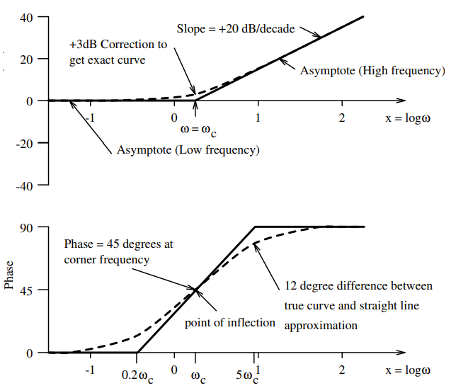
| Real Zero | 1. Draw low frequency asymptote at 0 dB. 2. Draw high frequency asymptote at +20 dB/decade. 3. Connect lines at ω0. (Mirror image, around x-axis, of Real Pole) | 1. Draw low frequency asymptote at 0° 2. Draw high frequency asymptote at +90° 3. Connect with a straight line from to (Mirror image, around x-axis, of Real Pole about 0°) |
| Underdamped Poles (Complex conjugate poles) | 1. Draw low frequency asymptote at 0 dB. 2. Draw high frequency asymptote at -40 dB/decade. 3. Connect lines at ω0. 4. If ζ<0.5, then draw peak at ω0 with amplitude , else don’t draw peak (it is very small). | 1. Draw low frequency asymptote at 0° 2. Draw high frequency asymptote at -180° 3. Connect with straight line from to |
| Underdamped Zeros (Complex conjugate zeros) | 1. Draw low frequency asymptote at 0 dB. 2. Draw high frequency asymptote at +40 dB/decade. 3. Connect lines at ω0. 4. If ζ<0.5, then draw peak at ω0 with amplitude , else don’t draw peak (it is very small). (Mirror image, around x-axis, of Underdamped Pole) | 1. Draw low frequency asymptote at 0° 2. Draw high frequency asymptote at -180° 3. Connect with straight line from to |
Examples
Simple Gain
An Integrator
Magnitude Plot:
 Phase Plot is skipped, too simple
Simple Lag
,
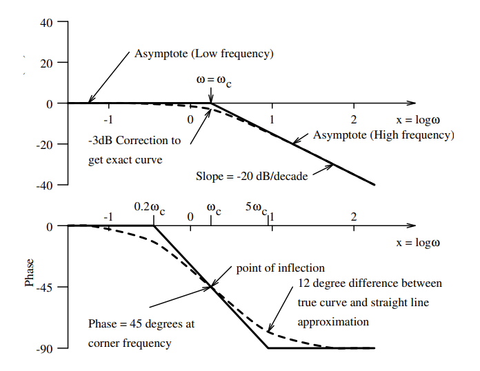 It is also possible to make a straight line approximation of the phase as shown in the lower figure.
Simple Lead
,
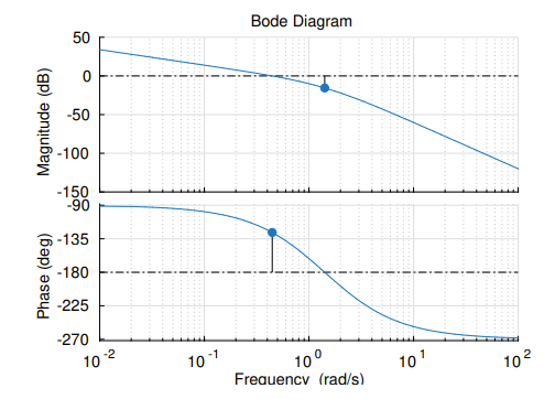
Gain and Phase Margin:
You can create the Gain and Phase Margin for our Bode Diagram using the following rules:
Gain Margin
The magnitude difference to dB at the frequency at which the phase reaches .
Phase Margin
is equal to the phase difference from at the frequency at which the magnitude is dB.
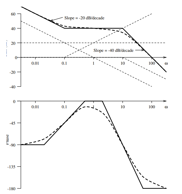
Ex ():
Worked Ex:
Ex 1:
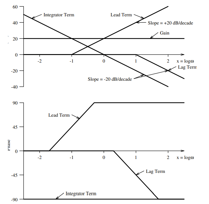
Original: Point 3.3.2 Page 28 Part 2
We can split this into mutiple sections:
- - The Gain Term
- - The Lead Term
- - The Integrator Term
- - The two lag terms
From this we can plot all of these on our two plots as straight line approximations:
 Note: from here, we are converting from using to using
This is fine, as we will logartihmically space our new graph.
Note: from here, we are converting from using to using
This is fine, as we will logartihmically space our new graph.
Magnitude Plot
Phase Plot
Which leads us to: